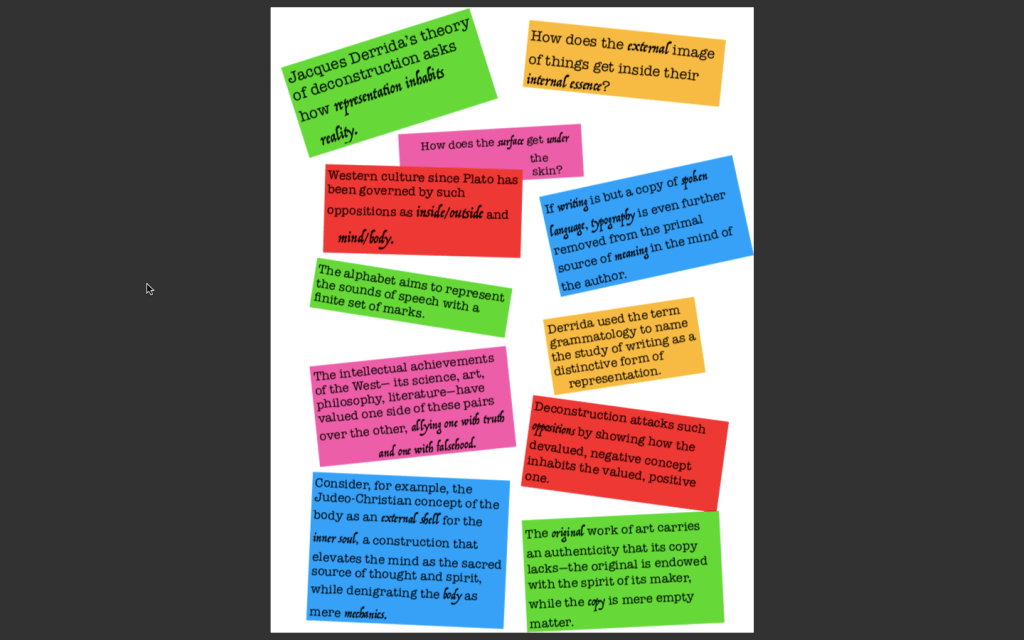
So for this exercise, I chose to focus more on direction and structure of typeface in order to create my visual. I chose the design challenge number 1, so I was tasked with retooling the type in “Deconstruction and Graphic Design.”
The liberty I took with my design was that of a student forming study cards to help formulate the argument. My chosen theme of the given essay was how binary oppositions create meaning in deconstructionism. In designing something that captured the swap between scientific like New Structuralism to that of Deconstructuralism, I thought a more playful school feeling would capture the idea of the opposite of truth in learning.
So, I used slanted cards to make it feel as if you yourself are progressively creating these cards to identify the meaning. I started off unsure of what to do with the direction, and as Williams mentions, when it comes to direction: “the inly thing I want to say is don’t do it” (Williams, 204) I likely didn’t have to add in direction here because as Williams points out, only use it if you can state a reason for it. I think something I might focus on in my revisions for the final is adding more “texture” to my piece. Page 207 mentions how certain direction can make the reading feel as if it’s actually present, and I think adding a bulletin board background with some shading on the cards is the final touch for that texture. To make them seem like a student has posted them to passively study as they walk by.
The primary purpose for this exercise for me was to put into practice direction. I also used it to work on combining the structures of typeface. I used two typefaces that have serifs, one of which was modern, being American Typewriter, and the other being a decorative typeface. The contrast was created with my perceived meaning of the text. Where I thought the importance of Binary oppositions were stressed or written, I highlighted it with the more free flowing writing to show the power of deconstructivism and how it flips the hierarchies. The rest of the writing was in American Typewriter to symbolize the object of quarrel, the more scientific nature academia has taken that Derrida’s deconstructivism aims to take down.
Overall I’m happy with where my design is at. I really challenged myself to have the words painted in different aspects. If I had to do it again, I think I’d go a more minimalist approach and use gaudier designs with less words, but overall the choice of words then becomes more impactful. Here I assumed we had to use the full reading and operated as such!
Works Cited
Williams, Robin. The Non-Designer’s Design Book. Peachpit Press, 2014.
